Ben Shneiderman's Tree Map Data Art Appears in the Maryland Computer Science Instructional Center
Reprinted from VisualisingData.com
Written By: Andy Kirk
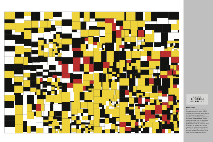
Details of a Treemap Art Project have come to my attention, showcasing data-generated artwork from one of the most influential names in data visualisation, Ben Shneiderman. The project has the compelling strapline ‘Every AlgoRiThm has ART in it’.
Ben has had a hugely distinguished career and is responsible for a host of notable achievements in this field, along with Human Computer Interaction. His ‘Eight Golden Rules of Interface Design‘ and ‘Visual Information-Seeking Mantra‘ are but two of his most enduring footprints on these subjects. However, I’m sure it would be the case that many people most associate him as the pioneer of the treemap visualisation technique.
He has been working on a summer project to create a set of artworks based on his treemap technique, which has now come to fruition with the hanging of 12 framed images (24 x 36 inches) on the walls in the University of Maryland Computer Science Instructional Center.

Whilst the noise has died down somewhat recently, the negative reaction many purists have to data art as a concept is often misplaced. Data art should be judged through a different lens to data visualisation. The latter is generally concerned with discoveries from or communication of data, whereas data art is more about self-expression or an exhibition using data. Sure, there may some consequential discovery or enhanced cognition about the underlying subject through the resulting patterns, but that is not the goal.
Although I conceived treemaps for purely functional purposes (understanding the allocation of space on a hard drive), I was always aware that there were aesthetic choices in making appealing treemaps, such as the layout, color palette, and, aspect ratio of the entire image. Also certain treemaps were inherently interesting because of the data displayed or patterns revealed.
Ben goes onto explains his belief that there are at least four aesthetic aspects of treemaps:
- Layout design (slice-and-dice, squarified, ordered, strip, etc.)
- Color palette (muted, bold, sequential, divergent, rainbow, etc.)
- aspect ratio of the entire image (square, golden ratio, wide, tall, etc.)
- prominence of borders for each region, each hierarchy level, and the surrounding box
The dedicated website tells the story, shows sets of draft designs, and full size PDFs for the 12 images. There is also a flyer for those who want a 2-page summary with all 12 thumbnails and some pictures of the installation.
Ben explains that the prints will be up for at least two months…
then we’ll see what happens… I’ve been getting increasingly enthusiastic feedback as we refined the designs. Now dealing with requests for prints, which is a good sign. It’s been very interesting to shift my thinking to the aesthetic side and commit to making artistic choices.
The Department welcomes comments, suggestions and corrections. Send email to editor [-at-] cs [dot] umd [dot] edu.

