Contest webpage:
Authors and Affiliations:
- Frank van Ham, F.J.J.v.Ham@tue.nl
Tool(s):
We used our submission for the InfoVis 2004 symposium to visualize the given dataset. This tool uses a modified force directed layout algorithm to generate a layout in which the distance between two clusters is inversely proportional to the strength of their coupling. After the layout is generated, a hierarchy is constructed by iteratively merging the closest nodes. On top of this prototype we added support for automatic labeling by keyword, coloring by property value and searching.
TASK 1: Static Overview of 10 years of Infovis
- Process:
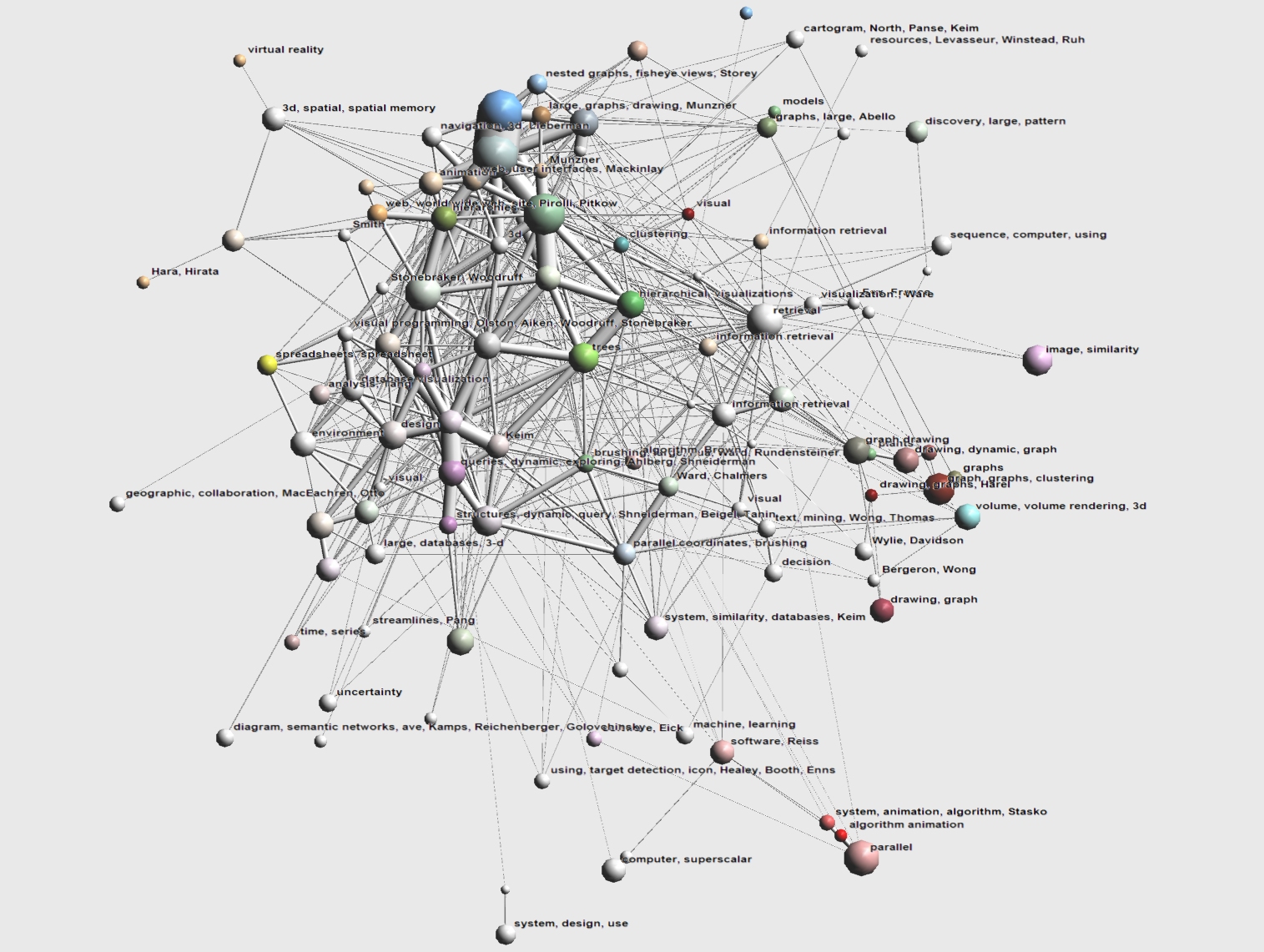
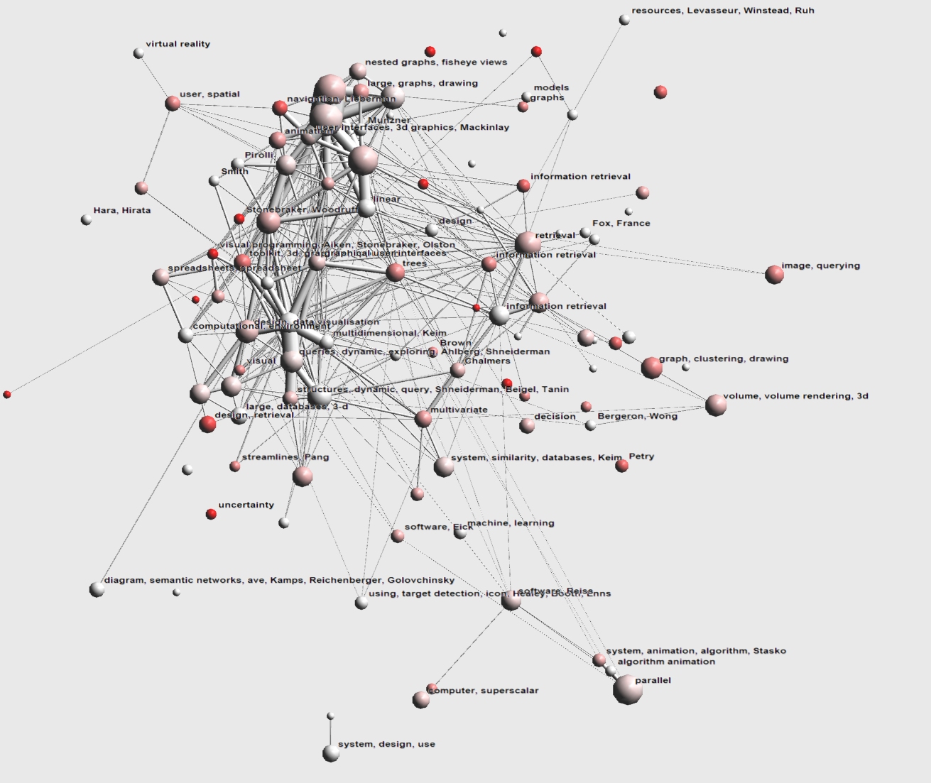
For this image we took the entire graph consisting of 613 nodes (i.e. papers) and 1971 edges (i.e. references). The biggest connected part consists of 591 nodes and 1968 edges. This part has an average shortest path length of 3 and a clustering index [1] higher than a random graph of the same size, so it has the small world property. Note that the dataset is slightly polluted in the sense that not all papers in the dataset were presented at the InfoVis symposium. A layout was generated for all 613 nodes using a modified force directed algorithm [2], in which the optimal distance between two groups of nodes is inversely proportional to their coupling (i.e. the number of edges connecting them divided by the total number of possible connections between them). The geometrically closest pair of nodes is then aggregated into a single cluster. We then repeat this process iteratively until we are left with a single cluster, giving us a hierarchy of clusters. Note that the number of clusters is arbitrary, in this case we wanted a not too coarse view and 150 seemed reasonable. If desired we can generate a view with an arbitrary number of clusters.
To allow us to apply semantics to each cluster we created a set of keywords for each paper, consisting of all its given keywords, all the words in the papers title, since some papers had no keywords assigned, and the author names. Finally, we remove common keywords (like Information Visualization) and meaningless keywords (like a and in) from these sets. We included the authors names in the keyword set since we suspect that some clusters of papers are formed by authors frequently citing their own papers. A major problem is that keyword spelling is very diverse, even a fairly well defined concept such as treemaps has keywords treemap, treemaps, tree-map and tree-maps.
This keywordset was applied to the generated clusters, where we threshold on common keywords. For a keyword to be included with a cluster in the image we require that more than 30% of the papers in that cluster have this keyword. This may seem a fairly low threshold (statistically speaking) but because of the large variety in keyword spelling its hard to find common ones. We inspected almost all meaningfully labeled clusters manually and found that their labels correspond reasonably well to the subject of their papers. For authors we performed the same procedure, but used a higher treshold of 50% since there are hardly any differences in author spelling.
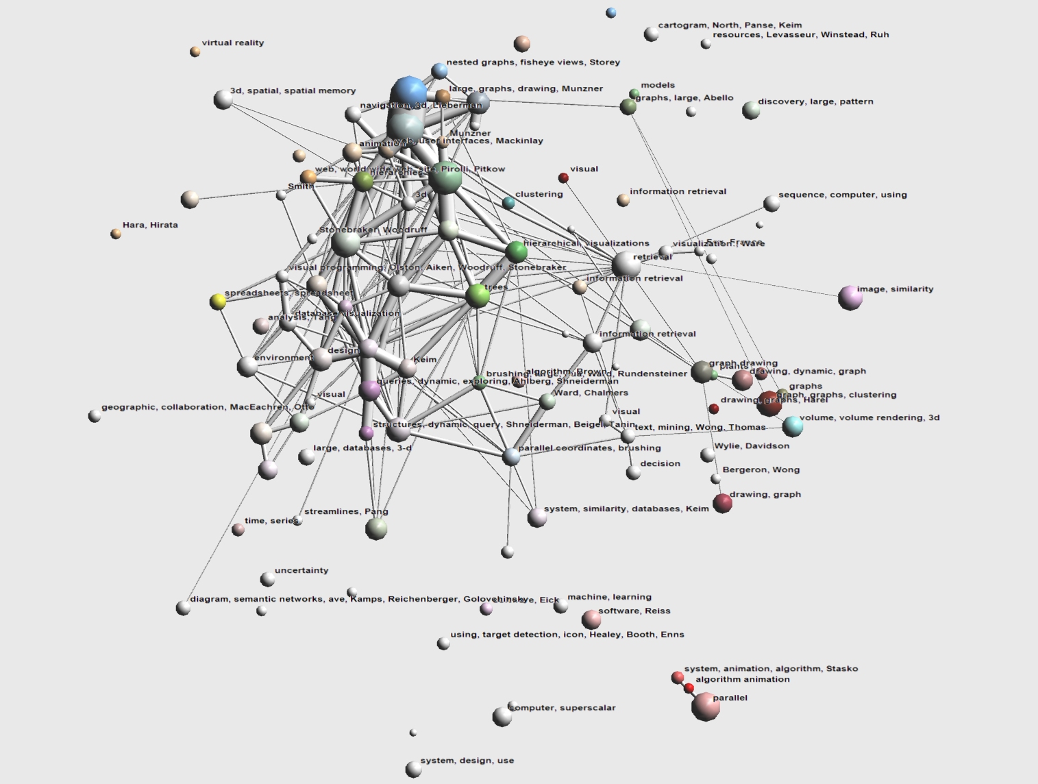
Since the core of the InfoVis graph was vey dense, leading to a lot of overlap in the labeling we used a fisheye distortion to enlarge this area. Finally, nodes were manually colored based on keywords to see if the layout was a good match for the actual data in the set. We used our own insight to match keywords to general themes such as focus+context visualizations (fish-eye, focus + context,...) hierarchy visualizations (tree, hierarchy,hierarchical,...), graph visualization (graph, graphs, ...). The cluster color is a weighted average of the node colors in that cluster. To reduce the cluttering created by edges we also included an image in which all aggregated egdes with a weight less than 2 are removed, although strictly speaking we are not using the entire dataset in this case.
- Image 1.1 :

- Insight:
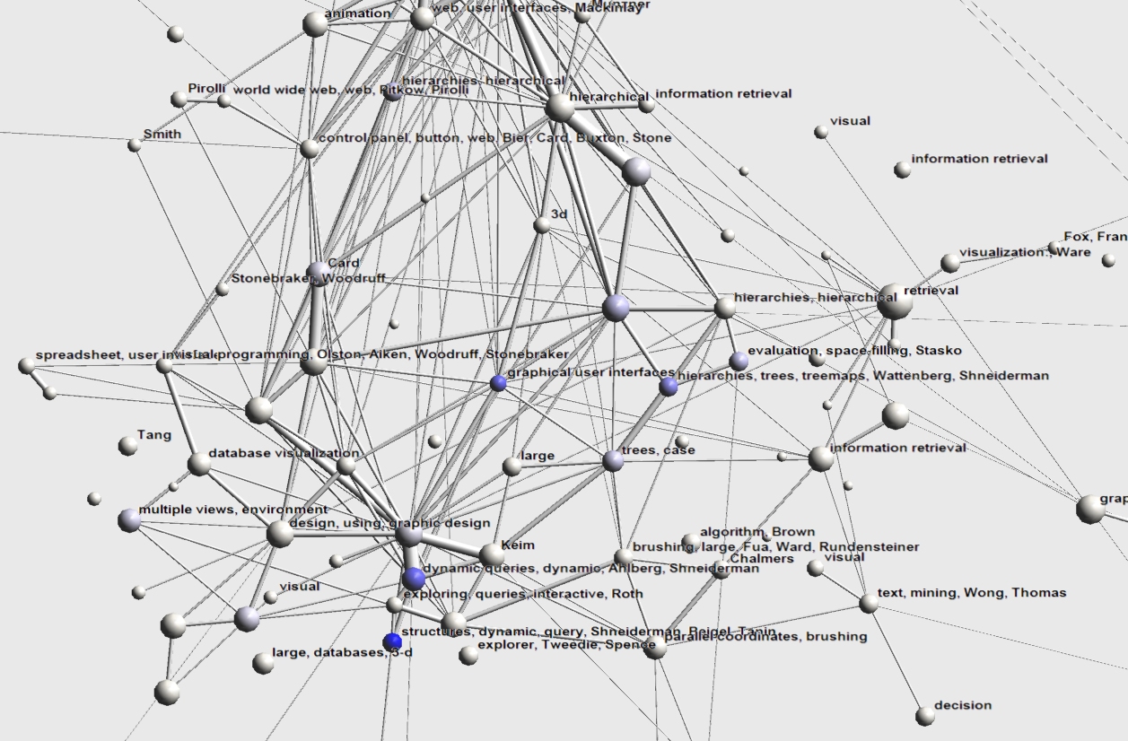
The first thing that immediately springs from this picture is how connected everything is. We hoped to find research areas formed by a coherent set of papers dealing with a specific technique, frequently citing eachother. Although we can identify some of these area (such as software visualization in red in the bottom right, image retrieval in pink, volume visualization in light blue, a fragmented graph drawing cluster in maroon near the right and a spreadsheet cluster in yellow on the left) a lot of papers deal with systems and cite a wide range of used techniques. This might be a consequence of the fact that Information Visualization is an applied science, in which no single technique will provide an optimal solution. Nevertheless, our layout algorithm can still identify some research areas in this Infovis core. On the top in blue, we find focus and context visualizations, on the bottom in purple are papers related to dynamic querying. Papers related to trees and hierarchies are displayed in green and also make up a large part of the core.
- Caption for exhibit:
Overview of 10 years of the InfoVis symposium. Papers and citations are mapped to a single clustered layout. Sphere area corresponds to cluster size, tube width corresponds to number of aggregated citations. Clusters are labeled based on common keywords/authors and are colored based on keywords.
- Image 1.2 :

- Insight:
Same image as 1.1, but all edges with a weight less than one (that is, edges representing a single citation between two clusters) have been elided to improve readability.
TASK 2: Characterize the research areas and their evolution
- Process:
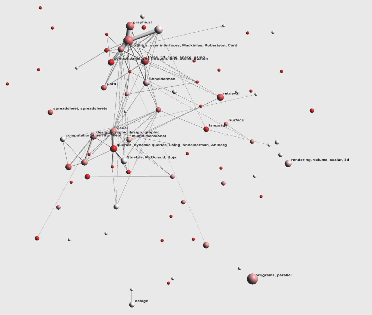
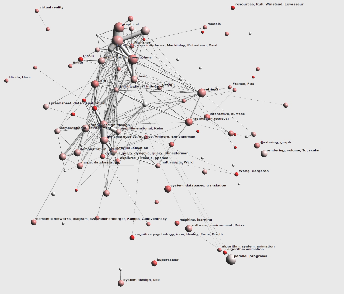
We used the same tool as above, but filtered the dataset to papers that were published in a certain time-interval. We incorporated a selection mechanism into the prototype that allows the user to interactively mark any time interval in the data. We then incrementally added 2 years of papers to the previous dataset, coloring the newly added papers in red to give an impression of the hotspots in those years. Note that the layout of the overall dataset is not changed when adding new papers to preserve the user mental map.
- Image 2.1:

- Insight 2.1:
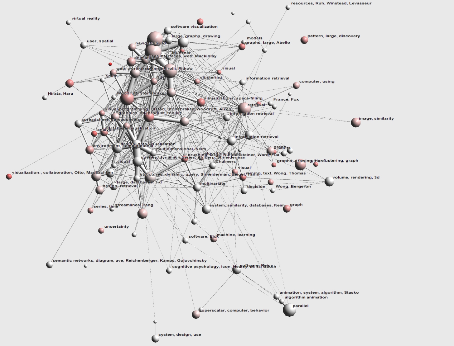
Between 1992 and 1994 the Information Visualization field consists of roughly 2 large groups of papers (note that sphere area represents cluster size in the pictures). One group is centered around HCIL and is marked with dynamic queries, dynamic, using, Shneiderman, Ahlberg. The other strongly connected (i.e. thick tube) clusters of papers centers around Xerox PARCs Infovis research marked 3D graphics, user interfaces, Mackinlay, Robertson, Card. Other notable clusters are the Algorithm visualization cluster in the bottom right (marked programs, parallel) and a Volume Visualization cluster on the right (rendering, volume, scalar, 3D). Based on the cluster colors (not bright red) we can state that this is older research.
- Image 2.2:

- Insight 2.2:
Between 1995 and 1996, new clusters emerge. Some of these can be attributed to new people and research groups joining the InfoVis field, such as Virginia Tech (France, Fox), UNH (Wong, Bergeron), Tamara Munzner at Stanford (Munzner). Other clusters can be attributed to research interest in new representations, such as the spreadsheet (clusters marked spreadsheet, data visualization) and new application areas such as databases (marked system, databases, translation and large, databases, 3D) and information retrieval (marked 'retrieval' and 'information retrieval). We also see the first (isolated) papers on graph visualization appearing near the center right (clustering, graph). Also interesting is a second cluster on dynamic queries (dynamic query, dynamic, query, Shneiderman) below the first.
- Image 2.3:

- Insight 2.3:
In 1997 and 1998 we mainly see an expansion of current research areas and not many new clusters. New clusters present are visual programming (visual programming, Aiken, Stonebraker, Olston and also Stonebraker, Woodruff) of UC Berkely and uncertainty visualization ('uncertainty') . We also see increased interest in image querying and graph drawing (previously present clusters have grown significantly).
- Image 2.4:

- Insight 2.4:
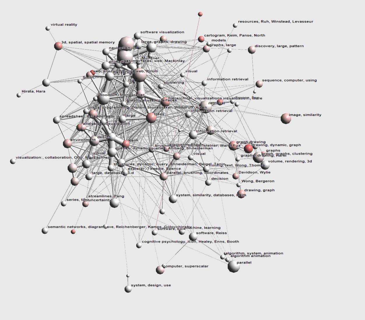
Apart from more expansion, 1999 and 2000 saw a renewed interest in treemaps (cluster marked visualizations, space-filling). Also a cluster brushing, large, Rundensteiner, Ward, Fua has appeared near the center right and an (isolated) cluster visualization:, collaboration, Otto, MacEachren all the way in the bottom left.
- Image 2.5:

- Insight 2.5:
After 2000 we see a renewed interest in hierarchy visualizations (clusters marked hierarchical visualization and trees). Also, a cartogram cluster has appeared in the top (cartogram, Keim, Panse, North). The graph visualization cluster also contains red clusters, signifying an increased interest. Also note that, contrary to previous years, relatively few papers are published in the large Infovis clusters of Xerox PARC and HCIL (absense of red).
TASK 3: The people in InfoVis
Task 3.1: Where does a particular author/researcher fit within
the research areas defined in task 2?
- Process:
We used a rendering similar to the global overview of the entire InfoVis field created in Task 1, but with a larger number of clusters. To reduce the amount of edge information we take out all aggregated links with a weight less than 2. After highlighting papers by a specific author in a single color, we use the cluster labels to make general statements on the research area this author is in. The user could inspect detailed information on the highlighted papers by using a local semantic distortion (see video).
- Image 3.1.1:

- Insight 3.1.1:
George Robertson (a.k.a. G. Robertson and George C. Robertson) has a total of 11 papers in this dataset. Highest concentration is in a cluster labeled Mackinlay suggesting Robertson either frequently cooperated with Jock Mackinlay or published papers that frequently referenced Mackinlay. Other papers are in the clusters 'graphs, fisheye, views' ("rich interaction in the digital library" and "the perspective wall"), 'hierarchical 3d' ("conetrees"), 3d ("information visualization using 3d interactive animation"). All are still reasonably close toghether. Other clusters further from the center are '3d, spatial, spatial memory' and 'large', containing respectively the "data mountain" and "constellation" papers coauthored after he moved to Microsoft, explaining the distance from the first set. Based on this image the work of George Robertson can be summarized with the keywords 3d visualization.
- Image 3.1.2:

- Insight 3.1.2:
Ben Shneiderman (a.k.a. Ben Schneiderman) has a total of 23 papers in this dataset. Immediately apparent are his contributions to dynamic querying (2 clusters in the bottom) and to hierarchical visualization/treemaps (trees, case, hierarchies, trees, treemaps, Wattenberg, Shneiderman, evaluation, space-filling, Stasko, hierarchies, hierarchical). A cluster labelled Card also turned blue, suggesting both cooperated on one or more papers. One of the unlabelled clusters should probably have been labelled treemaps, but wasnt due to keyword mismatching, keywords are tree-maps (12.5%), space-filling (12.5%) and space-filling visualization technique (12.5%). Based on the picture the contributions of Ben Shneiderman to InfoVis could be classified with the keywords dynamic queries and hierarchies.
Task 3.2: What, if any, are the relationships between two or more
or all researchers?
- Process:
For this task we interpreted the relations in the dataset differently. Instead of using reference relations directly, we defined a relation between two papers if they shared a common author. From this set we removed all papers that had no overlap with any other paper (i.e. its authors has only one paper at InfoVis). The resulting dataset has 415 nodes and 1594 edges. We used the same techniques as in the previous tasks to generate a layout and cluster the dataset. Individual papers can be interactively colored based on authors and keywords, while dynamic labeling was used to present detailed information on the papers. Note that another possibility might have been to use the author as the nodeset and define a relation between two authors if the coauthored a paper together. A disadvantage of this approach is that we have no extra information (such as keywords) on authors.
- Image 3.2.1:

- Insight 3.2.1:
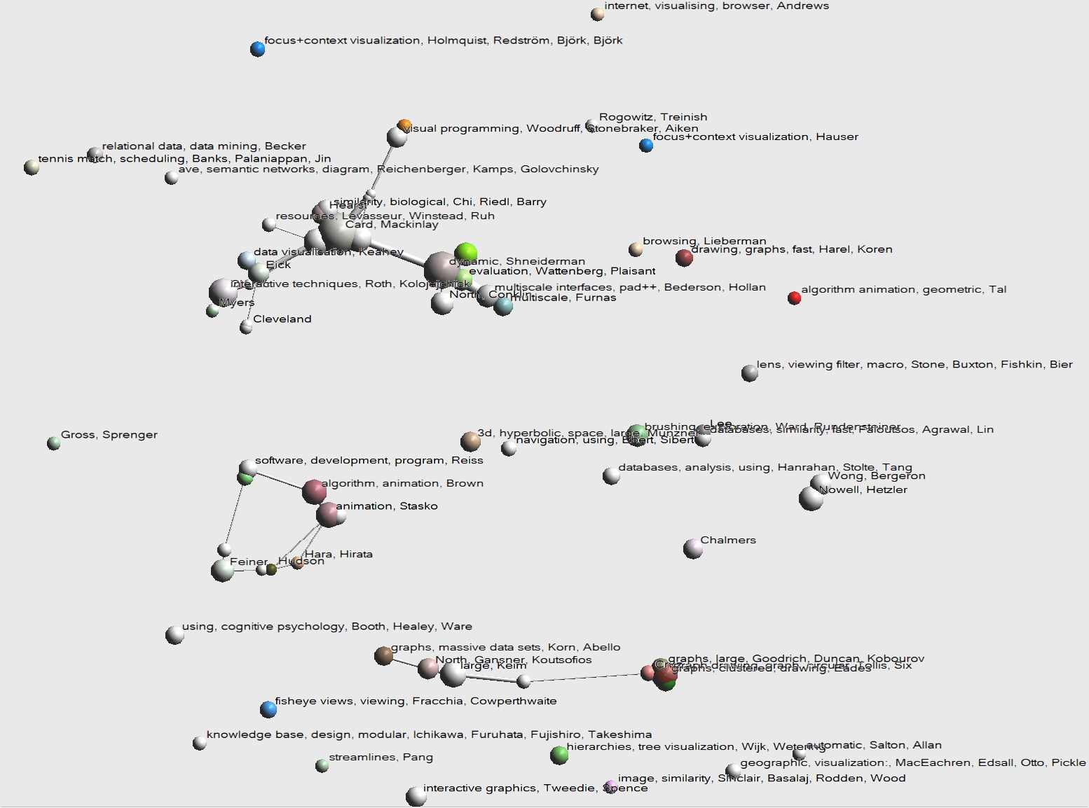
This image shows the cooperations between all authors in the InfoVis community. Interesting is the fact that we can identify 3 major clusters. The rest of the authors mainly cooperate with a fixed set of coauthors (usually from within their own institution). The image show a large cluster near the top left, centering around Xerox PARC, with HCIL to the right and a smaller cluster with Stephen Eick to the left. HCIL cooperates with Ben Bederson, who in his turn cooperated with George Furnas. Eick (Eick)apparently cooperated with somebody around Steven Roth (Interactive techniques, Roth, Kolojejchick). Closeup inspection learned this was Mei Chuah. The other cluster (center left) is mainly software visualization oriented connecting Brown, Stasko, Reiss and Feiner. Finally, there is a large cluster near the bottom related to graph visualization, most likely these are cooperations already present in the Graph Drawing community. Other interesting insights coming from this picture is that the Pacific Northwest Visualization group (Nowell, Hetzler) has almost no cooperation (at least in the form of jointly published papers) with other research groups (except for UNH through Pak Chung Wong), even though they have a substantial number of papers published at InfoVis and are located in the USA. We can also associate keywords with groups of authors and learn in one glance that van Wijk and van de Wetering mainly published on tree visualization and Harel and Koren cooperated on 'drawing, graphs, fast'. Cooperations are also strongly geographically bound, with most of the cooperation between groups in North America.
- Image 3.2.2:

- Insight:
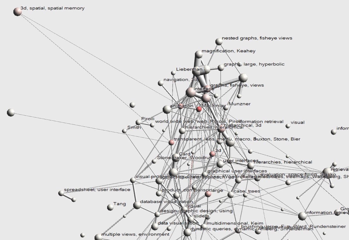
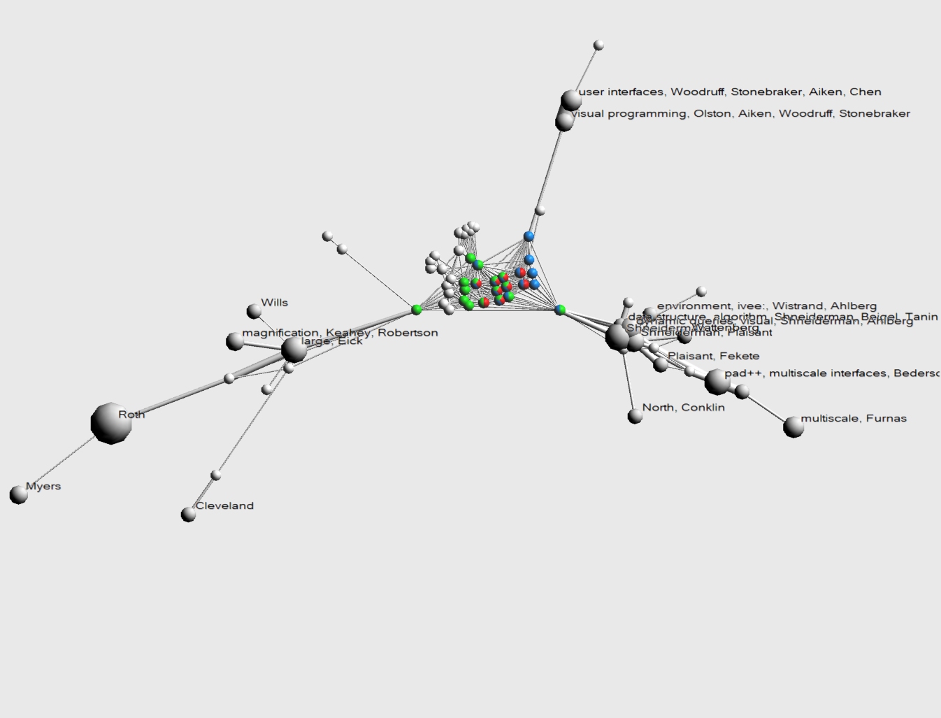
This image shows a close up of the Xerox PARC cluster, showing the explicit cooperation relationships between Stuard Card (green), George Robertson (red) and Jock Mackinlay (blue). Robertson coauthored 9 papers while at Xerox PARC and 2 while at Microsoft. The latter two are not shown but are in the '3d hyperbolic space, large, Munzner' cluster of Image 3.2.1. The majority of the 9 were coauthored by all three authors, 2 were coauthored with Mackinlay and NOT with Card and 1 was coauthored with Card and NOT with Mackinlay. Note that this does not exclude other coauthors that are not color marked, so there might be other coauthors on these papers. Also interesting is that all cooperation of Xerox PARC with other institutions/people can be attributed to both Card and Mackinlay, and that this cooperation rests on one single paper. We can use the mouse over information to find that the respective papers were Using Vision to Think with Ben Shneiderman at HCIL Information Visualization with Stephen Eick at Bell Labs and Nahum Gershon at MITRE and Visualizing Data with Bounded Uncertainty with Chris Olston at UC Berkley.
[1] D.J. Watts and S.H. Strogatz. Collective dynamics of 'small-world' networks. Nature 393, pages 440--442, 1998.
[2] A. Noack.An energy model for visual graph clustering. In Proc. 11th Int. Symp. on Graph Drawing, pages 425--436. Springer-Verlag, 2003.
Web Accessibility
