- Process:
IN-SPIRE can read free-formed ASCII text as well as most of the standard data formats,
including XML and HTML. The XML tags in the contest data allow IN-SPIRE to query different
combinations of fields to generate visualizations, query topics, and explore evidence.
We used an in-house data cleanup tool to standardize the dates recorded in different
formats and to mark as symposium papers the documents with source tags that matched any
of the eight InfoVis proceedings titles.
IN-SPIRE uses the unstructured text content of documents (e.g., the "abstract" field of the
contest dataset) to
identify an interesting set of words known as topics or themes that can be used to
distinguish clumps of similar documents within the collection. This process is based on
the particular word patterns in the collection at hand and does not transfer to other
collections. The co-occurrence or lack of co-occurrence of these interesting words and
other statistically associated words in documents is used to build a richer thematic meaning
for these representative topic words. Commonly appearing words that do not directly
contribute to the content—typically prepositions, pronouns, gerunds, etc.—are
ignored.
The system uses these topic word and associative patterns to build n-dimensional signature
vectors characterizing each document. The vectors are clustered and projected to 2-space
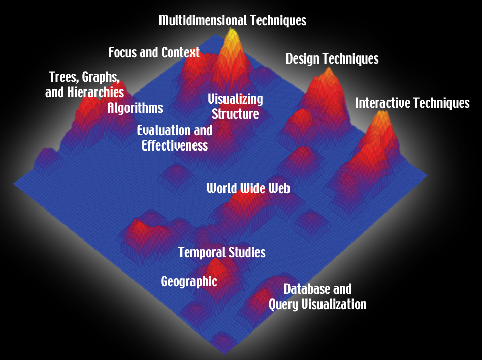
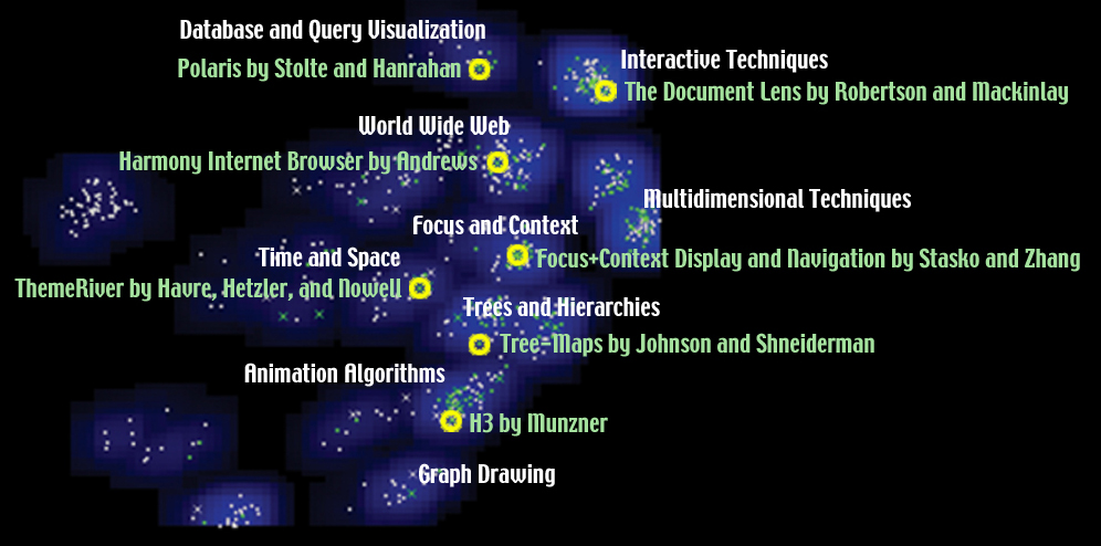
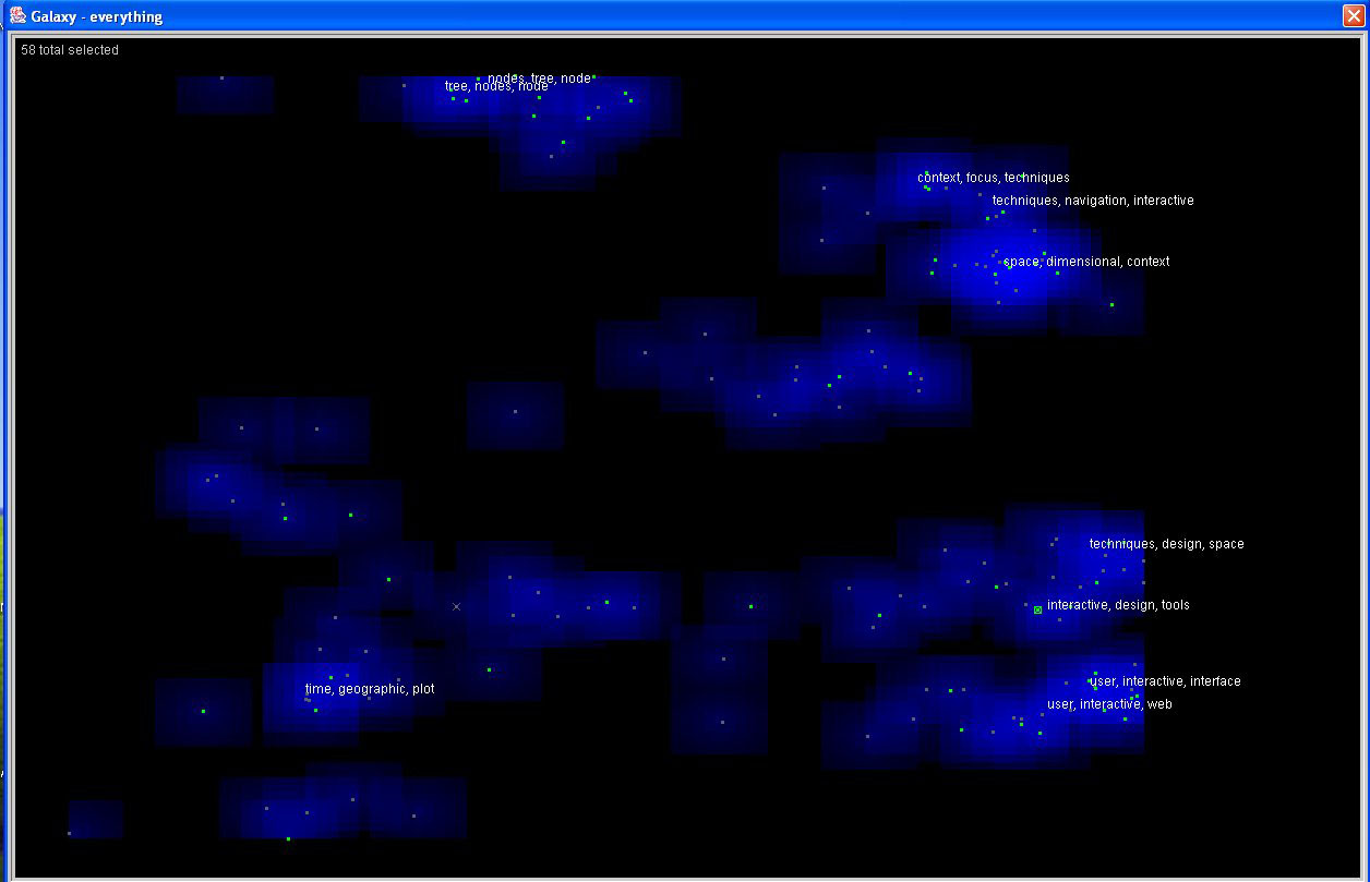
to create two visualizations—ThemeView (see Image 1.1) and Galaxy (see Image 1.2).
In these two visualization designs, a particular location on the map corresponds to a
specific topic found in the repository, and the distance on this map corresponds to semantic
similarities: semantically similar papers cluster around their major topics, while papers
with different content tend to lie apart in the map.
The above process description on IN-SPIRE is generally applied to all the following tasks.
In Task 1.1, we query only the symposium papers because we want to see the major
research areas at the symposium from 1995 to 2002. In Task 1.2, we query both the
symposium and reference papers in the analysis to show the contribution of the symposium
papers to the entire information visualization community.
IN-SPIRE can display the most salient topics of the most important clusters (in Galaxy)
and peaks (in ThemeView), any data fields included in the analysis, and word usage
statistics for each document. The topic labels in Images 1.1 and 1.2 are identified
by analysts after reviewing the contents of the clusters. Part of this analysis process is
shown in Tasks 2 and 3.
The overall shape of Image 1.2 is very similar to Image 1.1. If we flip Image 1.2
alongside the diagonal between lower left to upper right corners, we get almost the same
distribution as Image 1.1.
- Image 1.1 :

- Insight 1.1:
The two highest and brightest peaks are Multidimensional Techniques (top, ~19 papers) and
Interactive Techniques (right, 18 papers). Multidimensional Techniques focus more on
statistical methods, whereas Interactive Techniques are mostly related to visual designs
and interactions. Because of their strengths and dissimilarities, they occupy two of the
four major corners in the visualization.
Trees, Graphs, and Hierarchies (~15 papers) are other topics that form a major peak on
the left side. The theoretical theme of these papers also draws the Algorithms peak very
close to their neighbor.
We also see that the Temporal Studies and Geographic peaks are side by side—an indication
of a substantial number of articles (including cartogram and temporal distortion) that share
the two topics.
We are not surprised to find that the Focus and Context peak is very close to the Multidimensional
Techniques peak. Many symposium papers that address the focus and context problems also discuss
multidimensional techniques.
Finally, the field of Database and Query Visualization that covers well-focused areas of data
representation, modeling, and management forms a medium-sized peak in the lower right corner of
the visualization.
- Caption for exhibit:
IN-SPIREĺs ThemeView, a visual-analytic tool developed at the Pacific Northwest National
Laboratory, presents the major technical contribution areas of the Information Visualization
Symposium in aggregate over its 10-year history, as peaks in an information landscape.
- Image 1.2 :

- Insight 1.2:
Every major cluster has both green (symposium papers) and white (reference papers) dots.
(The white dots look gray in the screen capture.) So the evolution of the symposium papers
through the years is consistent with the community overall.
With the addition of more reference papers, we can clearly separate the topics between Graph
Drawing (bottom) and Trees and Hierarchies (middle). For example, the original Treemap paper
by Johnson and Shneiderman is in the Tree and Hierarchies cluster, which is far from the Graph
Drawing cluster. And there is a large population of symposium papers (green dots) that cover
both Graph Drawing and Trees. Tamara Munznerĺs H3 paper is one.
Multidimensional Techniques (right) and Interactive Techniques (upper right) continue to be two
of the major (bright blue) clusters. However, the distance between them is less than the distance
in Image 1.1, indicating a common sharing of the two topics in many reference papers.
The very well-focused area of Database and Query Visualization continues to be isolated (top). A signature
paper of this area is the Polaris paper by Stolte and Hanrahan.
While the Database and Query Visualization peak stays prominent, the neighboring Temporal Studies
and Geographic peaks in Image 1.1 are no longer major topics in Image 1.2, indicating that they are
more popular in the symposium than the community overall.
- Caption for exhibit:
IN-SPIREĺs Galaxy, a visual-analytic tool developed at the Pacific Northwest National Laboratory,
displays the knowledge contributions of the Information Visualization Symposium as a clustered
information starfield. Topical clusters are shown and captioned in blue; symposium papers are
green dots; reference papers are white stars; and selected symposium papers appear as yellow
"supernovae."
- Process:
For this analysis, using the full set of InfoVis papers and references, the text characterization
is based solely on the abstract and title fields, with no upfront training. We did not use the
keyword fields, because many documents do not contain them, and we wanted the text content to
determine the similarity, not the human keywording.
- Image 2.1:

- Insight 2.1:
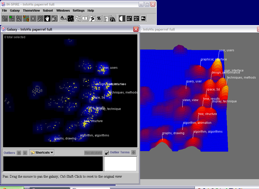
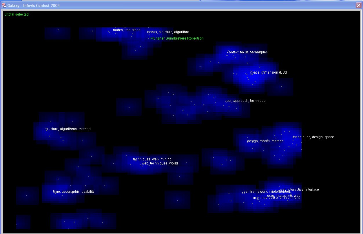
IN-SPIRE uses statistical word patterns to identify discriminating themes, cluster the documents
based on thematic similarity, and automatically generate labeled visualizations as a start for
user exploitation. The ThemeView landscape metaphor uses height reinforced with color to show
dominant theme combinations. Spatial proximity shows thematic similarity. Here, the ThemeView
shows that the dominant themes in this dataset include users, interfaces, techniques, and methods
(labels on the highest peaks), with a range of other themes represented, including queries, time,
trees, and graphs (labels on lower peaks). The Galaxy view is based on the same spatial layout,
where each dot represents a single document. The blue clouds are a 2D version of the peaks in the
landscape; the intensity corresponds to theme prominence but is more visually subdued, because the
individual documents are the main focus in the Galaxy view. We created a group consisting of the
InfoVis papers and colored them yellow, while the gray dots are the references. We see that the
papers fall into several clumps corresponding to various dominant theme peaks. We also note some
outlier clusters representing reference clumps that are relatively different from the main body of
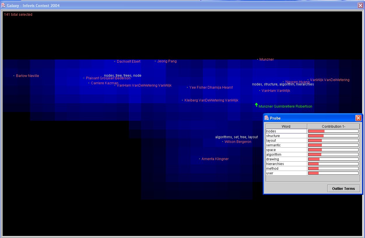
the collection. To explore unlabeled clumps, we can use the Probe tool, which shows not only the
main themes but also their relative strength in that area. An arrow shows us exactly which spot
in the thematic space is represented by the pop-up window (see video for interaction details).
Additional thoughts: Some capabilities that would help make this initial insight process easier
include a label optimization approach to deal with overlapping labels and the ability to take the
probe contents and make them "stick," essentially adding a label at any user-indicated spot.
- Image 2.2:

- Insight 2.2:
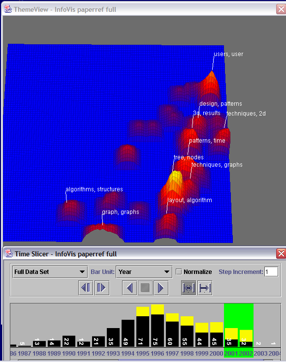
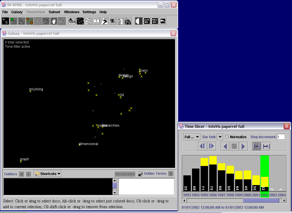
(Please see video to watch the interaction of time slicer with the Galaxy and ThemeView
visualizations.) The time slicer shows us the distribution of documents over time (we open the
time slicer by clicking on its icon in the tool bar). Here the yellow shows again the InfoVis
papers, while the black is the references. We can also use the time slicer as a filter to constrain
the portion of documents to show. The documents stay in the same locations, and the peaks and labels
are recalculated to show the dominant themes corresponding to the documents in that time segment.
This tool allows us to see several shifts in theme distribution over time. For example, the
combination of years ĺ74-85 shows a scattering of themes, with the strongest in the algorithms area.
In contrast, the years ĺ93-94 show a strong dominance of user design themes. Walking through time,
starting in ĺ95, we can watch the shift in theme dominance for the InfoVis conference years. Many
still show prominence in the user/interface/design region in the upper right, until we reach the years
2001-2002, which have stronger themes related to trees.
Additional thoughts: the current implementation does not provide a capability to directly compare
two or more time windows in the visualizations or to watch a smooth transition between them.
- Image 2.3:

- Insight 2.3:
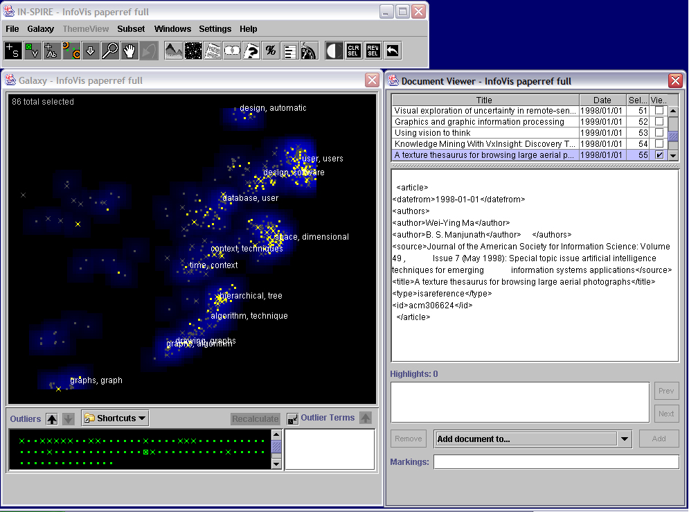
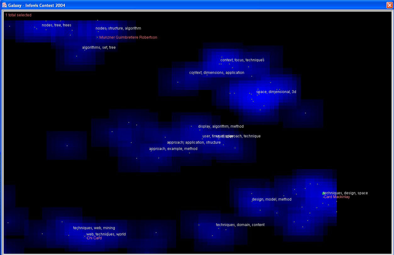
The outlier clumps in the main Galaxy view, although containing a number of documents, do not show
up as high peaks in the landscape. They do not contain any symposium papers, as shown by the lack
of yellow. If we use the Select tool to drag over and select them, then open the Document Viewer,
we can read the underlying text. As the example above shows, we see that they contain no abstracts;
hence the text analysis is based solely on the title. The outlier tool allows users to move empty
or less interesting documents aside, so they can see more detail on other documents. We click the
down arrow to move these documents down, and then click the Recalculate button to cause the remaining
documents to recluster and reproject (see video for interaction). Users may use this approach to
progressively converge on a set of interest. In the image above, we show the results after some
documents are moved down. The labels show that additional themes, such as context, emerge as theme
labels.
Additional thoughts: The initial interaction for moving documents back and forth from the main Galaxy
to the Outliers area became cumbersome, especially when the current selection set matched what a user
wanted to keep in the Galaxy. We solved this issue by making a Shortcuts pull-down with options to
make the Galaxy view reflect the current selection set, the colored dots corresponding to groups, or
the full document set. It also allows users to save custom views.
- Image 2.4:

- Insight 2.4:
Color-coding the InfoVis papers yellow in the Galaxy allows us to see how they relate to the larger
body of references. We turn off the blue Theme clouds (item in the Settings menu) and reduce the
labels to enhance visibility (a dialog box under Settings allows us to change both the number of
labels and the number of words per label). If we use the time slicer to step through the years of
the InfoVis conference, we see that the yellow documents are mostly in the upper right area (the
user design area), but as time progresses, more seem to appear in the left and lower left. This
suggests that the themes present in InfoVis papers have become more diverse over time. Please see
video to watch the change over time.
- Image 2.5:

- Insight 2.5:
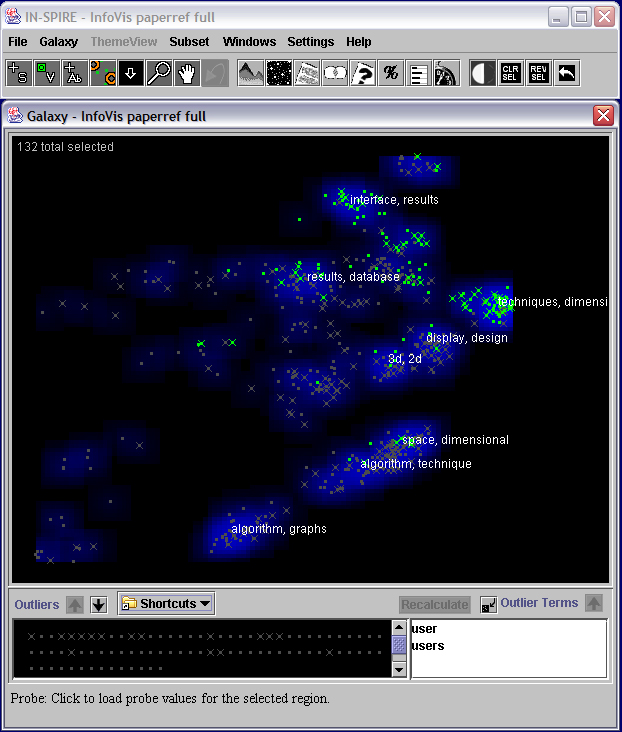
IN-SPIRE also allows the user to directly modify the choice of words that have a strong influence
over the document clustering. For example, recall the strong clump in the upper right showing that
the themes user and users are dominant among those documents. We can select those particular words
and remove their influence by designating them as outlier terms. If we then click the Recalculate
button, the documents are reclustered and projected. The image above shows the result. The green
documents were ones that came from that upper right clump; we see that the green documents now
distribute over several clumps. This indicates that the secondary themes among those documents
were diverse.
Additional thoughts: There is currently no capability to show where a particular document moves
during such reclustering. This would help with fine analysis. Also there is no animation of the
transition, which might help the user follow the path of particular documents of interest.
- Image 2.6:

- Insight 2.6:
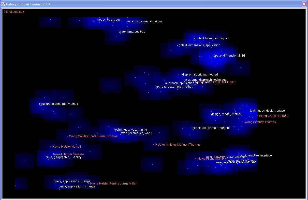
IN-SPIRE also allows multiple kinds of queries to let users explore interactions among word
presence, thematic similarity, and time trends. To run a Boolean query, users open the query
tool, select the scope, and type in the query text. They can make a group from the result. They
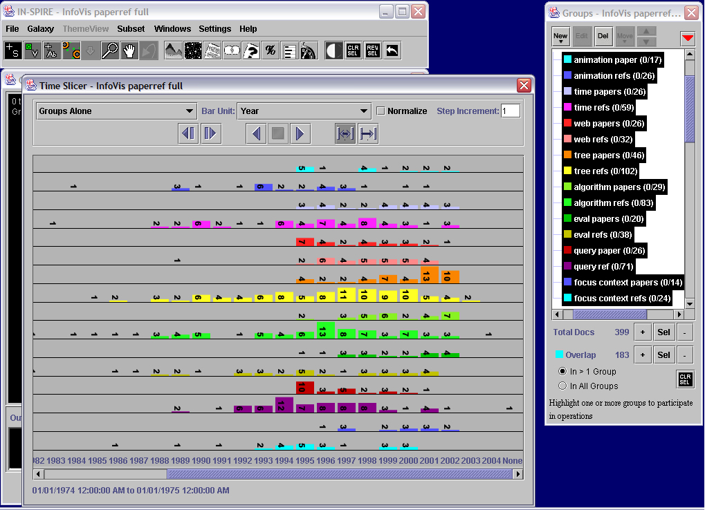
can also combine multiple groups. Here we have made groups of documents that contain particular
words related to popular themes indicated by the labels, separated by whether the documents are
InfoVis papers or references. If we click on a group, the member documents are shown in the group
color in the Galaxy. In the video, we highlight the different groups, noting that some query
groups are more distributed around the Galaxy, such as evaluation, while others are more
concentrated, such as the query groups on trees and on algorithms. This shows the correspondence
between documents that contain particular words (query group members) and documents with thematic
similarity (clusters). It suggests that documents containing the word "trees" tended to be
thematically similar to each other, while documents containing the word "evaluation" tended to cover
a variety of additional themes. We can also look at these groups over time. In one mode, the time
slicer shows all the selected groups stacked to represent their portion of the whole time segment.
In the alternate mode, it separates out each group to allow more detailed analysis of the individual
trends. For example, we see here that the tree papers group grows over time while the query groups
decrease. (Please see video for interaction details.)
Additional thoughts: As the utility of groups has increased, we have needed to continually look at
the flexibility and ease of interaction. There is currently no easy way to cross-compare sets of
groups, such as to compare all theme groups to all publication sources.
