InfoVis 2004 Contest
Exploring and Visualizing the History of InfoVis
Contest webpage:
Authors and Affiliations:
- Daniel A.Keim, University of Konstanz, keim@inf.uni-konstanz.de
- Christian Panse, University of Konstanz, panse@inf.uni-konstanz.de
- Jörn Schneidewind, University of Konstanz, schneide@inf.uni-konstanz.de
- Mike Sips, University of Konstanz, sips@inf.uni-konstanz.de
- Helmut Barro, University of Konstanz, barro@inf.uni-konstanz.de
Tool(s):
To find solutions for the 3 contest
tasks, we applied different visualization
approaches. One technique we used, is adapted from a popular
visualization tool for movie data sets, called FilmFinder (C. Ahlberg and B. Shneiderman CHI1994). We applied a similar technique to the contest database
and called our technique PaperFinder.
To show the connection and collaborations of authors we use a graph
drawing approach. If we assume, that the authors are the nodes of the graph and
edges represent paper
collaborations, the goal is to find strong connected components (SCC) in order
to identify groups of authors, which published most papers together. Then we
employed a spring embedder to find a graph layout for the computed SCC's, in
order to get a graph layout without node occlusion. Another technique we used is based on Interrings (J. Yang ,O. M. Ward,E.
A. Rundensteiner InfoVis02), to show for a single author all his co-authors
over time. All approaches are implemented in JAVA.
TASK 1: Static Overview of
10 years of Infovis
- Process:
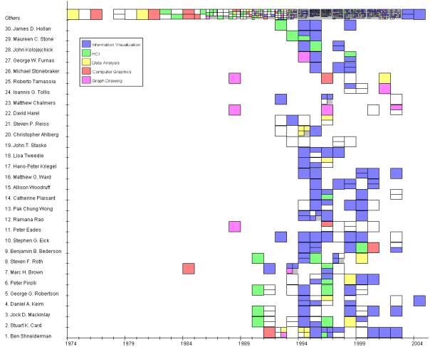
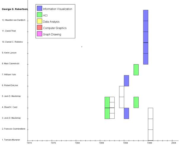
The figure shows the our PaperFinder technique applied to the contest database. PaperFinder is adapted from the FilmFinder technique introduced by B.Shneiderman The basic idea is to use the x-axis for the time attribute (year) and the y-axis for the dependent attribute, here author name. For the y-axis attribute we used also conference name and number of co-authors The color represents the topic each paper belongs to.
·
Image
1.1 :
- Insight:
We defined 5 categories to which we assigned the papers, depending on their keywords: HCI, Data Analysis, Computer Graphics and Graph Drawing. What is shown in the figure is a ranking of the authors contained in the data set, depending on the number of publications. On first position is Ben Shneiderman with ~18 publications, Second Stuard K. Card with 12 publication,… It is also easy to see to which categories the papers of the authors belong. The first papers from B. Shneiderman, for example, were computer graphics and data analysis papers, the newer ones are information visualization papers. It is easy to see to which research area each researcher fits, shown by the color of his research papers. Stephen Eick for instance has only InfoVis papers while George Robertson has InfoVis and HumanComuterInteraction publications.
·
Caption
for exhibit:
Top 30 authors, based on number of publications
TASK 2: Characterize the
research areas and their evolution
·
Process:
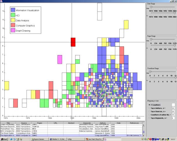
In this approach we used PaperFinder to show the number of co authors for each
paper over time and the color again shows the categories of each publication .
The figure also shows the linking functionality and the ability of user
interaction of our technique. The user can click on specific papers and gets
all information for this particular paper, which is contained in the database
·
Image 2.1:
·
Insight
2.1:
As the figure shows there where no information visualization topics before
1990, but after 1990 there was a strong increase in Info Vis topics so that
today most papers come from this area. Its also interesting to see that the
number of co-authors increase, before 1989 there were in most cases only 1,2 or
3 authors on 1999 there were also papers with 5 or 6 co-authors. In 2003 there
where a lot of paper keywords missing, so that we could not identify the paper
categories which corresponds in a lot of white/blank rectangles.
·
Image
2.2:
·
Insight
2.2:
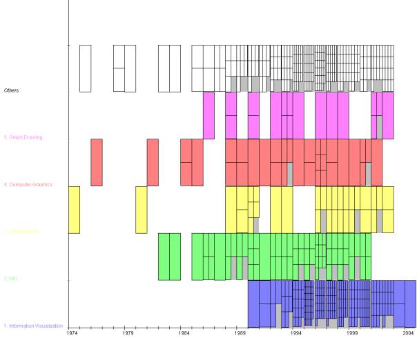
Figure 2.2 shows the development and number papers belonging to the 5 research
topics over the years. The papers are ranked by number of papers per topic.
Most papers were submitted for InfoVis topic,…If an paper as keywords belonging
to multiple topics we assign this paper to the topic with the highest number of
papers.As you can see there are not so much papers about graph drawing in the
database, but a lot about Information visualization and HCI. Its also interesting
to see that the first papers with keywords belonging to InfoVis were published
in 1989.
·
Image
2.3
·
Insight
2.3: The figure
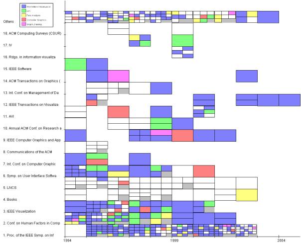
shows the distribution of research papers over the years 1994 to 2004. The
papers are ranked by number of publication and shown are the 18 Conferences/Journals
with the most publications. InfoVis received most publications, second is
Conf.on Human Factors in Computation, Third is IEEE Vis. One can see that for
books are no keywords defined (only white fields). The most papers submitted to
InfoVis are InfoVis topica papers and keywords for InfoVis papers are missing
for InfoVis 2003(white fields).Its easy to see that AVI takes place only every
two years (blanks between 2 entrys).
TASK 3: The people in
InfoVis
Task 3.1: Where does a
particular author/researcher fit within the research areas defined in task 2?
·
Process:
Paperfinder to analyze all publications of G.Robertson
·
Image
3.1.1:
·
Insight: One can clearly see the co-authors
of G.Robertson over the year. Most papers he had with S.K.Card and J.D.
MacInlay. Some paper topics were not defined (no keywords). All other papers
are from the InfoVis and HCI reseach field. In Image 1.1 it is also easy to see
to which research area a particular researcher fits, visualized by the color of
his publications
Task 3.2: What, if any,
are the relationships between two or more or all researchers?
·
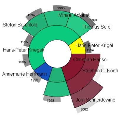
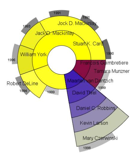
Process: We applied the interring technique
to investigate for a single author the number of his co-authors. The basic idea
of the interring is to place the data items as circle segments in an circular
layout. Each cirlce corresponds to the publications belonging to one author
Each circle segment represents a co-author. Different co-authors are showm by different
colors.. The size of a segment indicates the number of publication the author
had with this co-author. On the outside of the circle the year of this
publication/collaboration with the co-authors is showm.
·
Image
3.2.1:
·
Insight:
The image shows the co-authors of Daniel A. Keim. It is easy to see that he had
many publications with, H.Kriegel between 1994 and 1996, but no publications
with him after 1996 It is also
easy to see that the total number of publications is 10..
·
Image
3.2.2:
·
Insight:
·
The image
shows the co-authors of G. Robertson. It is easy to see that he had many
publications with, Mackinlay, Card. Its also easy to see that he had a paper
with5 co-authors in 1998. The number of total publications was 9.
·
Process:
To show
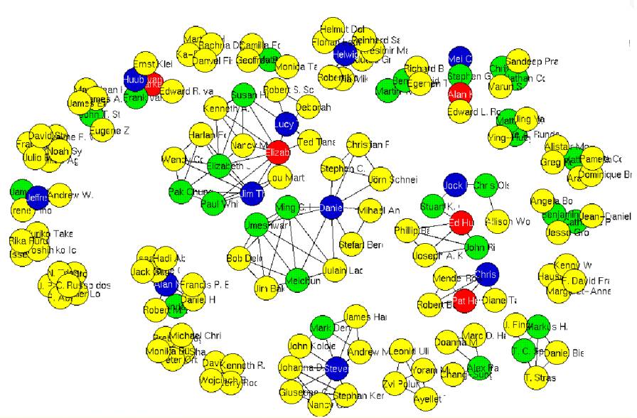
the connection and collaborations of authors we use a graph drawing approach. If
we assume, that the authors are the nodes of the graph and edges represent paper collaborations, the goal is to
find strong connected components (SCC) in order to identify groups of authors,
which published most papers together. Then we employed a spring embedder to
find a graph layout for the computed SCC's, in order to get a graph layout
without node occlusion.
·
Image
3.1.1:
·
·
Insight: We used a graph drawing approach
to analyse the test data set. To keep the layout readable, we shortened the
author names. The interesting thing that turns out, is that there are cliques
of authors. For example one can see the research group around Daniel Keim
(center of the figure) with members like Ming C. Hao, Umeshwar Dayal, Jörn
Schneidewind, Christian Panse, Stefan Berchthold. There are other groups like
the group around Jim Thomas (left to Daniels group) with Pak Chung Wong,.. or
the Stanford group around Pat Hanrahan (right to Daniel).
OTHER TASKS (optional)
You can address more tasks
and report more insights if you wish. Just follow the same format as above.
COMMENTS (optional)
When processing and visualizing large data
sets, data cleaning as part of data pre-processing is a very important step,
since it directly influences the quality of the visualization.
Since there where some inconsistencies in the
contest data set, like ambiguous authors or different formats and spellings for
the conference names,
some data cleaning was necessary. Therefore we
wrote some shell scripts, based on regular expressions, to correct these
inconsistencies. Additionally we corrected the spelling of some author names
manually.
Another problem was, that for several
attributes no values were recorded. An example are the keyword attributes, were
for a lot of publications the keywords were missing. For these publications we
extracted some keywords from their title. For other missing attributes we set
their value to not defined and handled it as special cases in the
visualization step.