Initial visualisations of the InfoViz04 citation network revealed that it was a scale-free network.
Traditionally, social networks are modeled as random networks where the degrees of nodes in the network follow a bell-shaped Poisson distribution. However, random network models fail to explain the existence of hubs and cliques in the network. The reason is that random network models don't capture two important factors in the formation of social networks: growth and preferential attachment [1, 2]. These two mechanisms help to explain the existence of hubs and cliques: as new nodes appear, they tend to connect to the more connected nodes, which results in the power-law distribution of the node degree. Such network is also called scale-free network which is abundant in nature and society, describing such diverse systems as the WWW, chemical network of cell and collaboration network. For the contest data, we have constructed citation network, cocitation network and coauthor network from the raw data. Statistics in their degree distribution show that they conform to the definition of scale-free network. For scale-free network, hubs in the network have special importance [3, 4], for example under malicious "attack" [5] (it may assume different meaning under different context). So in our layout, it's reasonable to emphasize those hubs in the networks.
To visualise this graph we used a "Two and a Half Dimensional" approach, constraining nodes to lie in layers (or parallel planes). Each node in the citation network represents one paper. The assignment of nodes to layers was done as follows:
- nodes with incoming degree (number of citations by other papers) >=20 were assigned to the top most layer
- nodes with incoming degree 10-19 were assigned to the next layer down.
- nodes with incoming degree < 10 other authors
To find a suitable layout for this reasonably large graph (with XXX nodes) in an interactive time we implemented a force directed algorithm using a spatial decomposition method [6] to reduce the complexity of calculating the repulsive forces between every node (normally this would be O(n^2) time per iteration).
- [1] Albert-László Barabási and Réka Albert. Emergence of scaling in random networks . Science 286, 509-512 (1999).
- [2] A.-L. Barabási, E. Ravasz and T. Vicsek. Deterministic scale-free networks. Physica A 299, 559-564 (2001).
- [3] Albert-László Barabási and Zoltán N. Oltvai. Network Biology: Understanding the Cells's Functional Organization. Nature Reviews Genetics 5, 101-113 (2004).
- [4] Albert-László Barabási and E. Bonabeau. Scale-free Networks. Scientific American 288, 60-69 (2003).
- [5] R. Albert, H. Jeong, and A.-L. Barabási. Error and attack tolerance in complex networks. Nature 406 , 378 (2000).
- [6] A. Quigley. Large Scale Relational Information Visualization, Clustering, and Abstraction. PhD thesis, University of Newcastle, Australia, 2001.
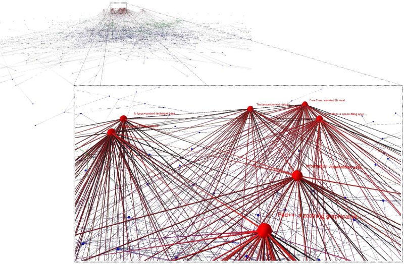
The image shows the entire citation network. Hubs, or high degree nodes are constrained to lie on the higher layers and the force directed layout causes these highly connected nodes to be reasonably centred resulting in the "volcano" like effect. The zoomed section identifies 7 of the most highly cited papers.
The image shows the entire citation network. Hubs, or high degree nodes are constrained to lie on the higher layers and the force directed layout causes these highly connected nodes to be reasonably centred resulting in the "volcano" like effect. The zoomed section identifies 7 of the most highly cited papers.

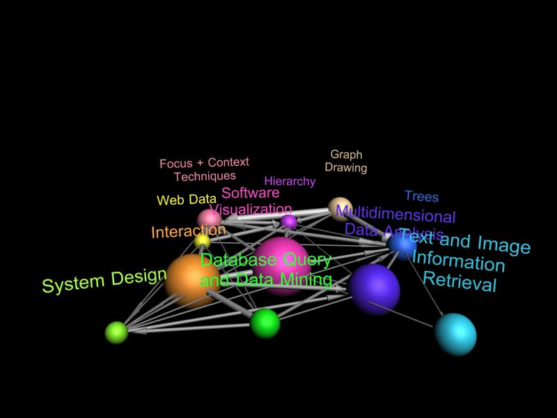
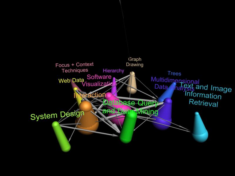
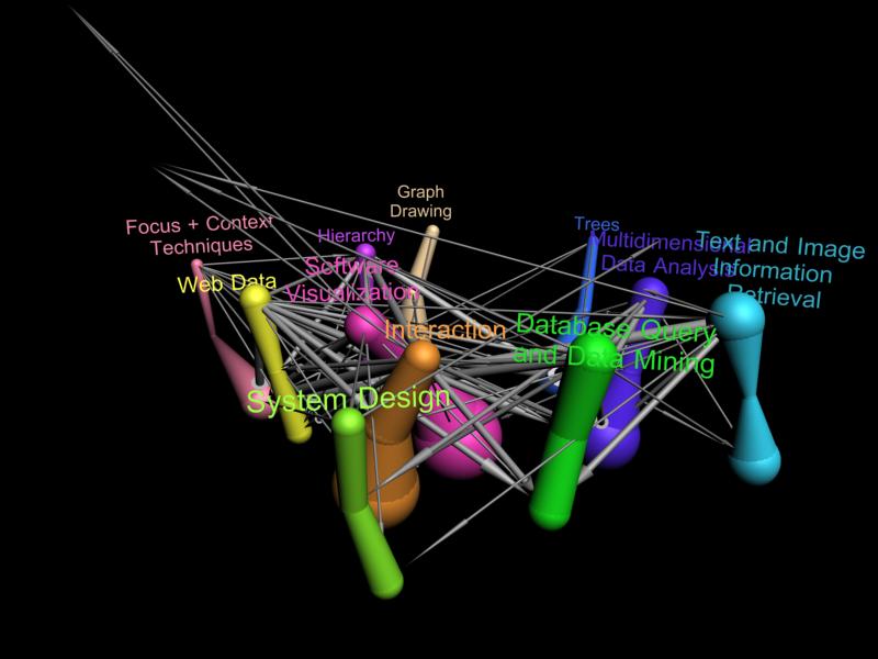
Each "worm" in this image shows the evolution of a different research area. Each level corresponds to the papers published in a particular year (1993 at the bottom 2004 at the top). Edges indicate citations papers in one research area in a particular year to papers in another research area. The thickness of each worm segment indicates the number of papers published in the corresponding year in that research area. Worms lean and bend towards each other when they are strongly coupled (there are many citations between them), otherwise they bend apart.
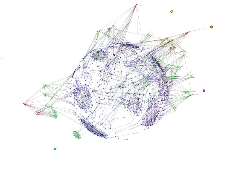
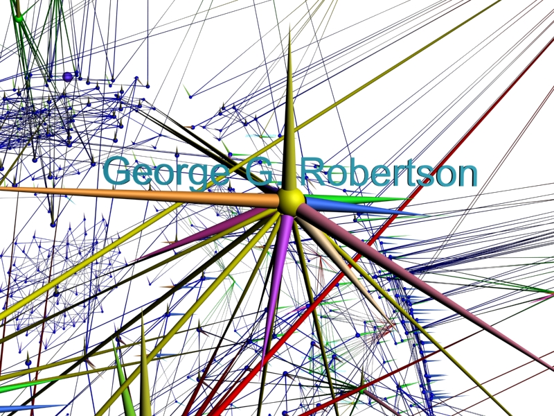
In our movie we show an extensive tour of our various views of the co-author network, focusing on these cliques and clusters and highlighting prominant authors.
